Project 3: Conceptual & Physical Design
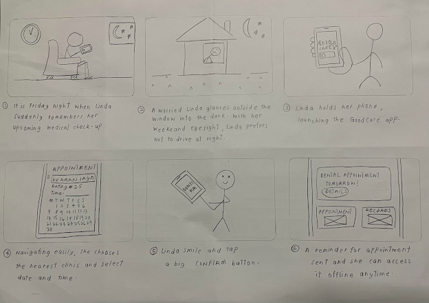
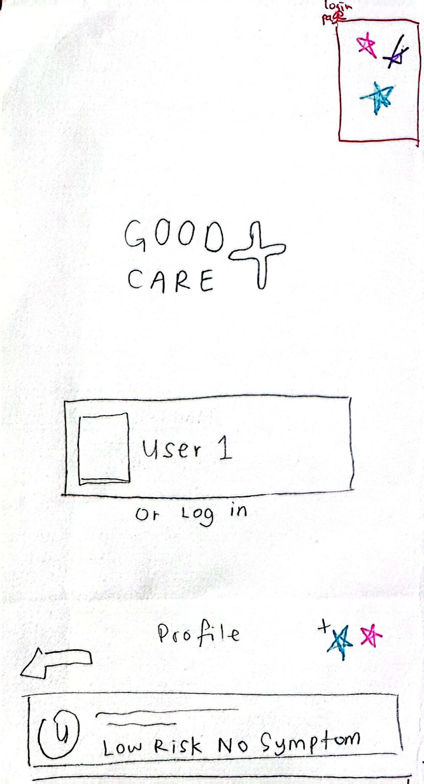
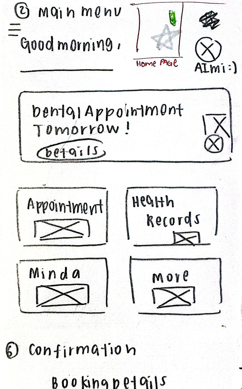
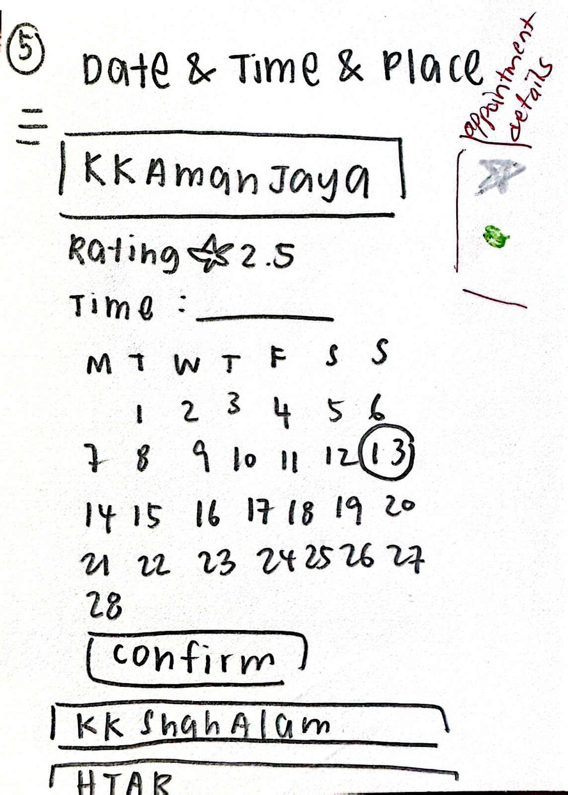
Storyboard
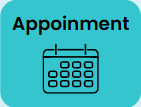
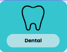
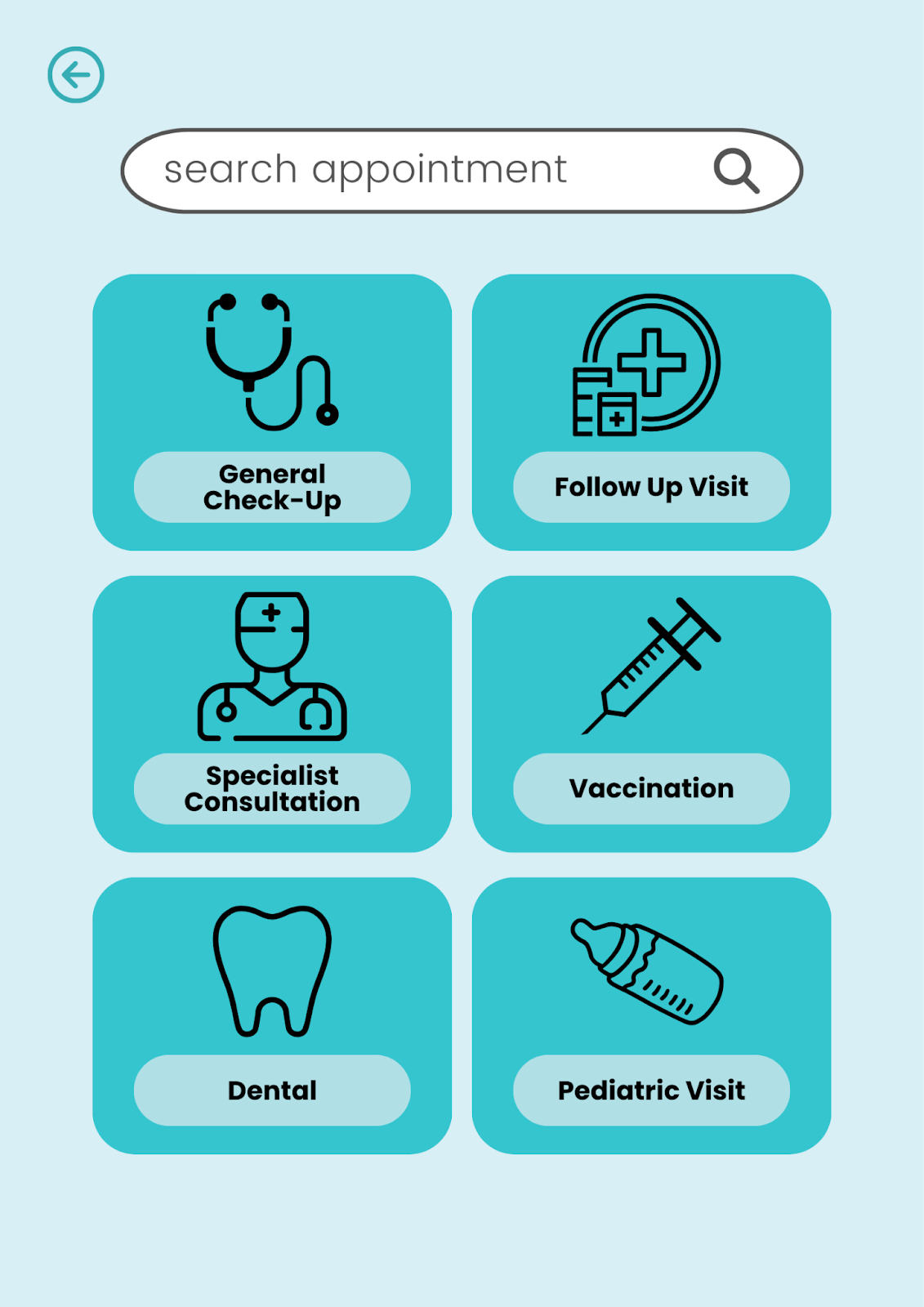
Task 1 - Book an Appointment
Task 2 - Assessing Mental Health
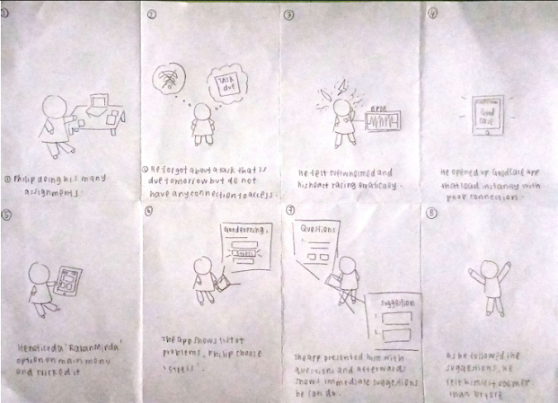
Task 3 - Ask a Question to the Help Desk

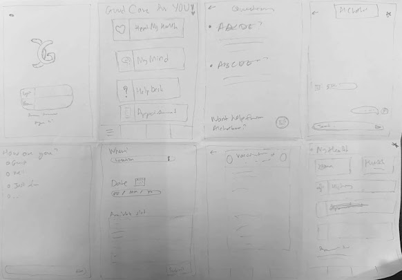
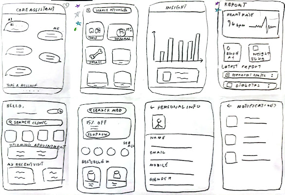
Alternative Designs - Crazy 8 Sketches
Alternative Design 1 - Arina Sofiah binti Hamede
Alternative Design 2 - Azdayana Batrisyia binti Azahari
Alternative Design 3 - Khairunnisa binti Mohd Hazani
Alternative Design 4 - Nurin Iffah binti Ahmad Borhan
Alternative Design 5 - Syarah Aqilah binti Ya’acob
Voted Designs and Element
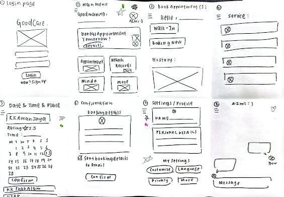
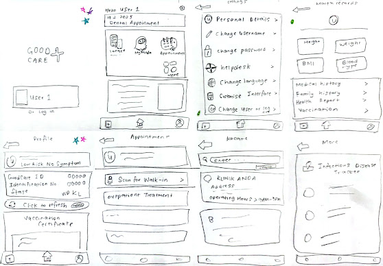
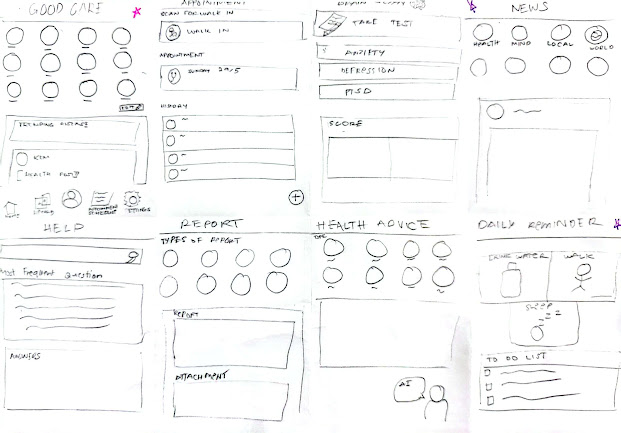
Wireframes
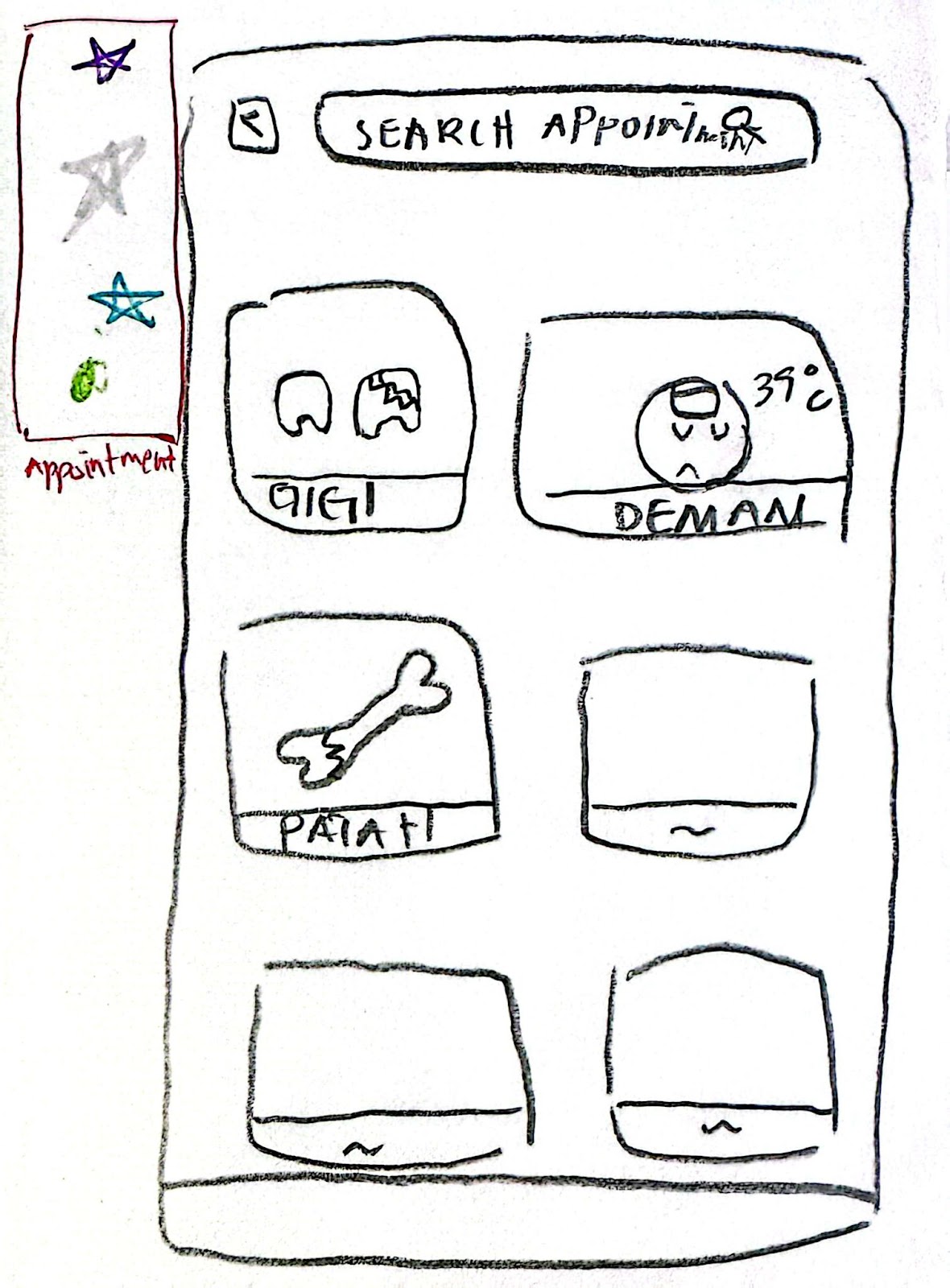
Task 1 - Book an Appointment
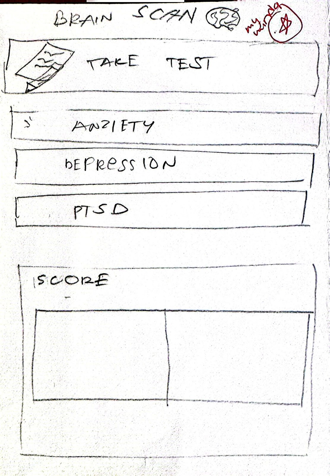
Task 2 - Assessing Mental Health
Task 3 - Ask a Question to the Help Desk

Justification of the Designs
Shneiderman's 8 Golden Rules of Interface Design
1. Consistency:
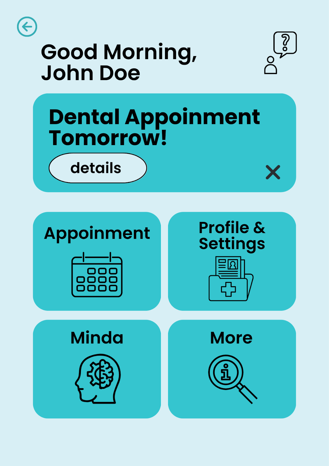
A fundamental aspect of the design philosophy was to establish immediate recognition and predictability for the user. A consistent application of a distinct teal color is evident for all primary interactive elements across the application. This visual consistency extends from high-level navigation buttons on the Home screen (e.g., "Appointment," "Minda") to specific service selections on the Home screen, and critically, for action-oriented buttons such as "confirm" on the Appointment Details screen and "Book an appointment" on the MINDA screen. This deliberate choice ensures that users can instinctively identify clickable components.
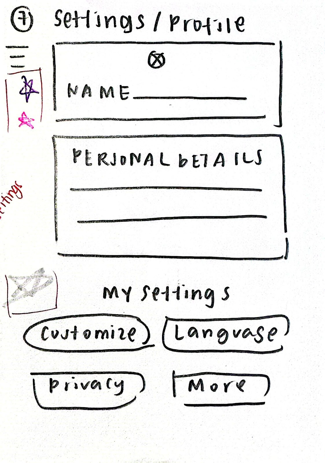
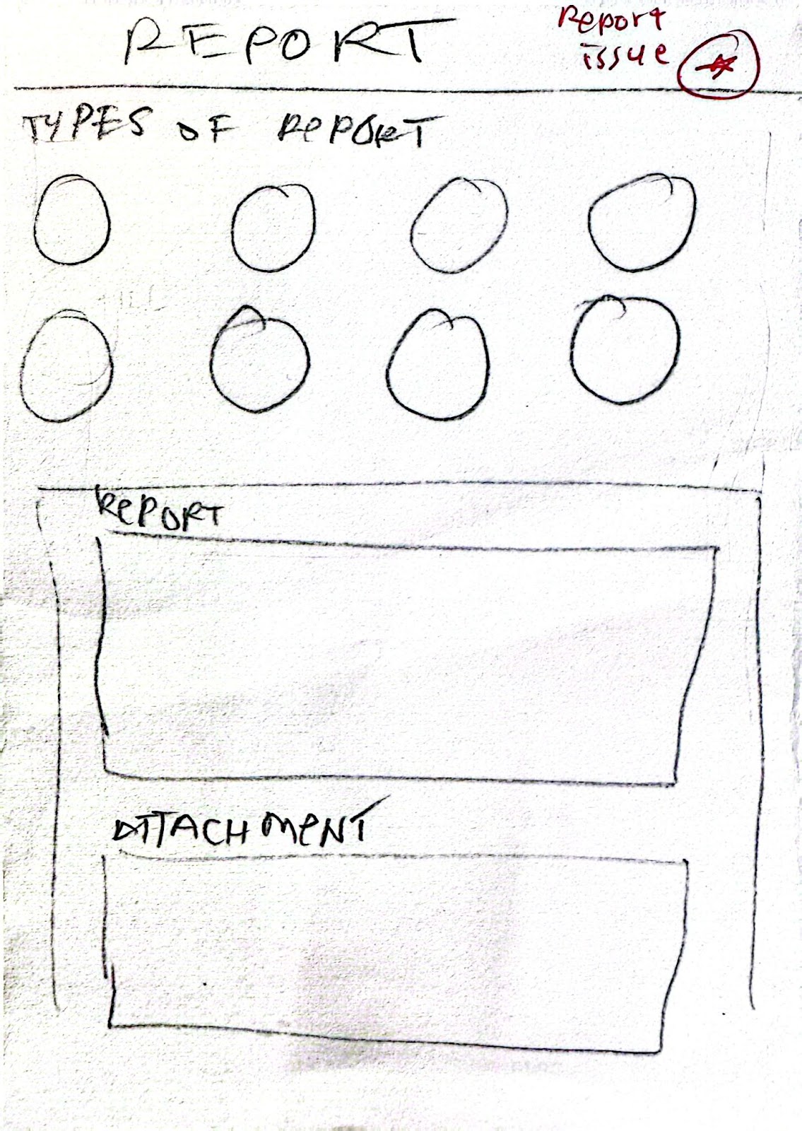
Furthermore, a constant back arrow icon, consistently positioned in the top-left corner across nearly all screens provides a reliable and predictable navigation mechanism. This uniformity minimizes cognitive load, allowing users to move through the application with confidence. A consistent visual grouping strategy was also utilized, employing distinct rectangular containers for related information, such as "Personal Details" and "My Settings" on the Profile and Settings screen, or the "Report Type" categories on the Issue Report screen. This consistent visual hierarchy enhances user's scanning ability and logical information organization.
2. Shortcuts:
While direct keyboard shortcuts are not a primary consideration for this mobile interface, the design facilitates efficiency for frequent users. The Home screen prominently features direct access points to core functionalities "Appointment," "Profile & Settings," and "Minda." This strategic placement allows power users to bypass unnecessary navigation steps, directly accessing their most common tasks with minimal taps. For instance, a regular user can initiate the appointment booking process immediately upon launching the application.
3. Informative Feedback:
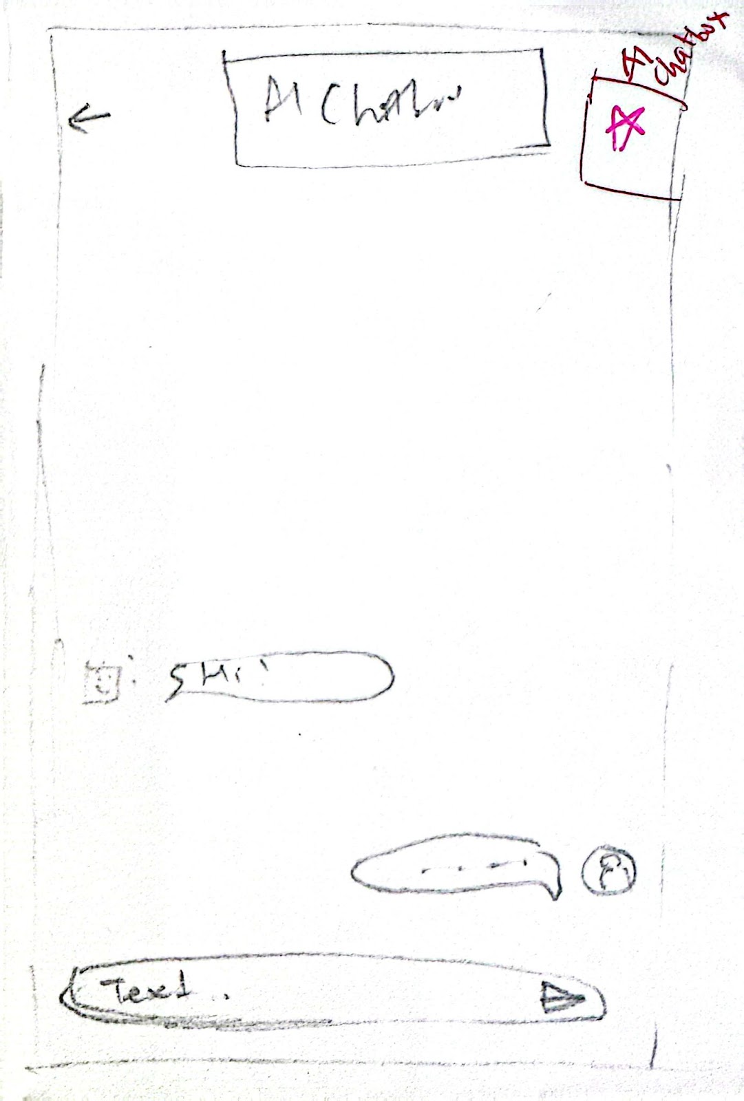
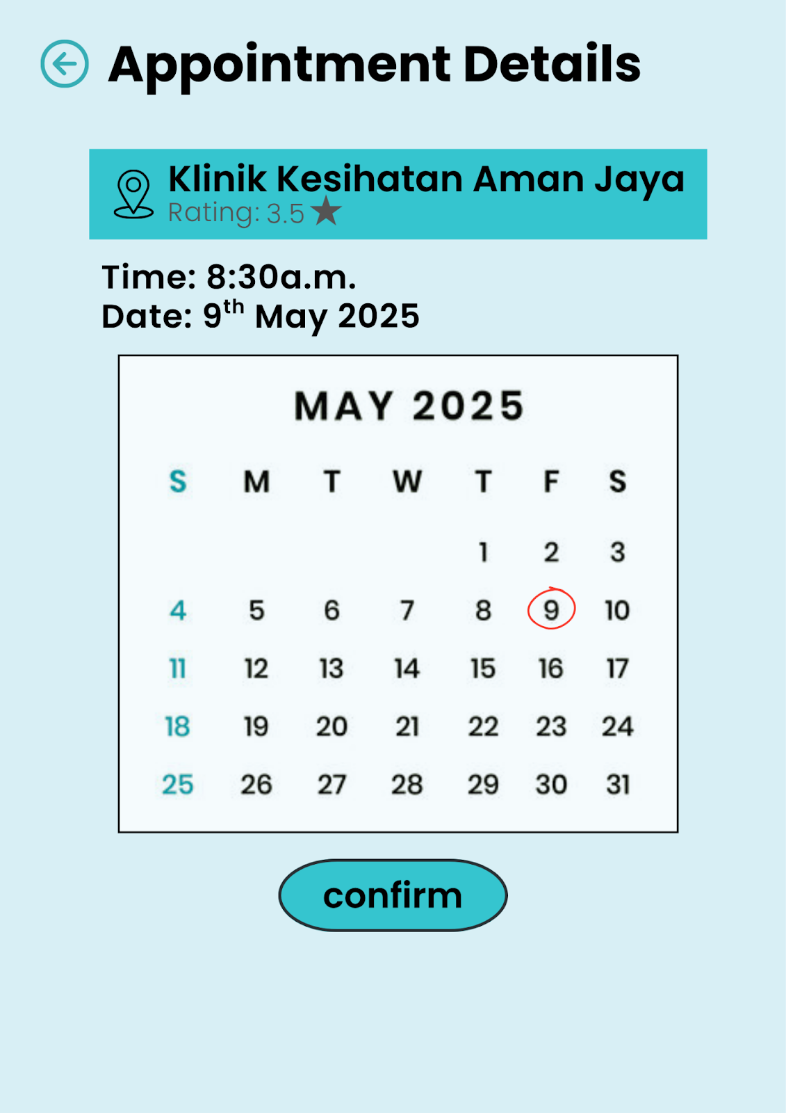
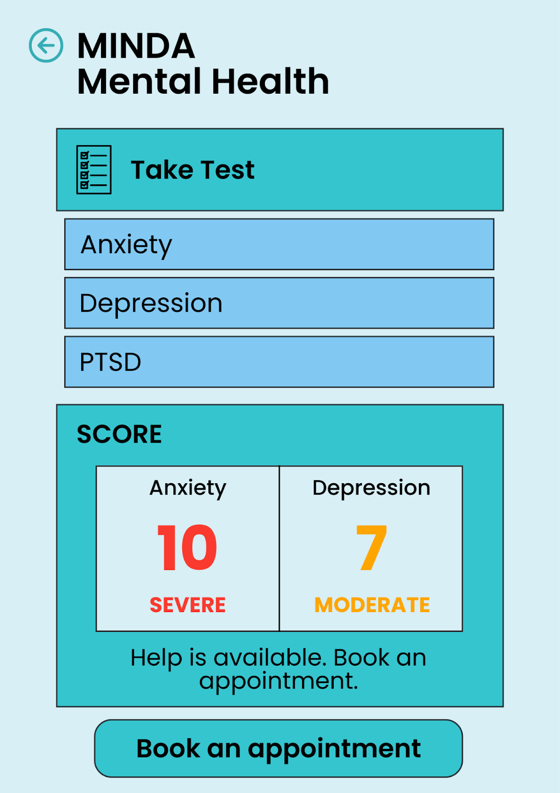
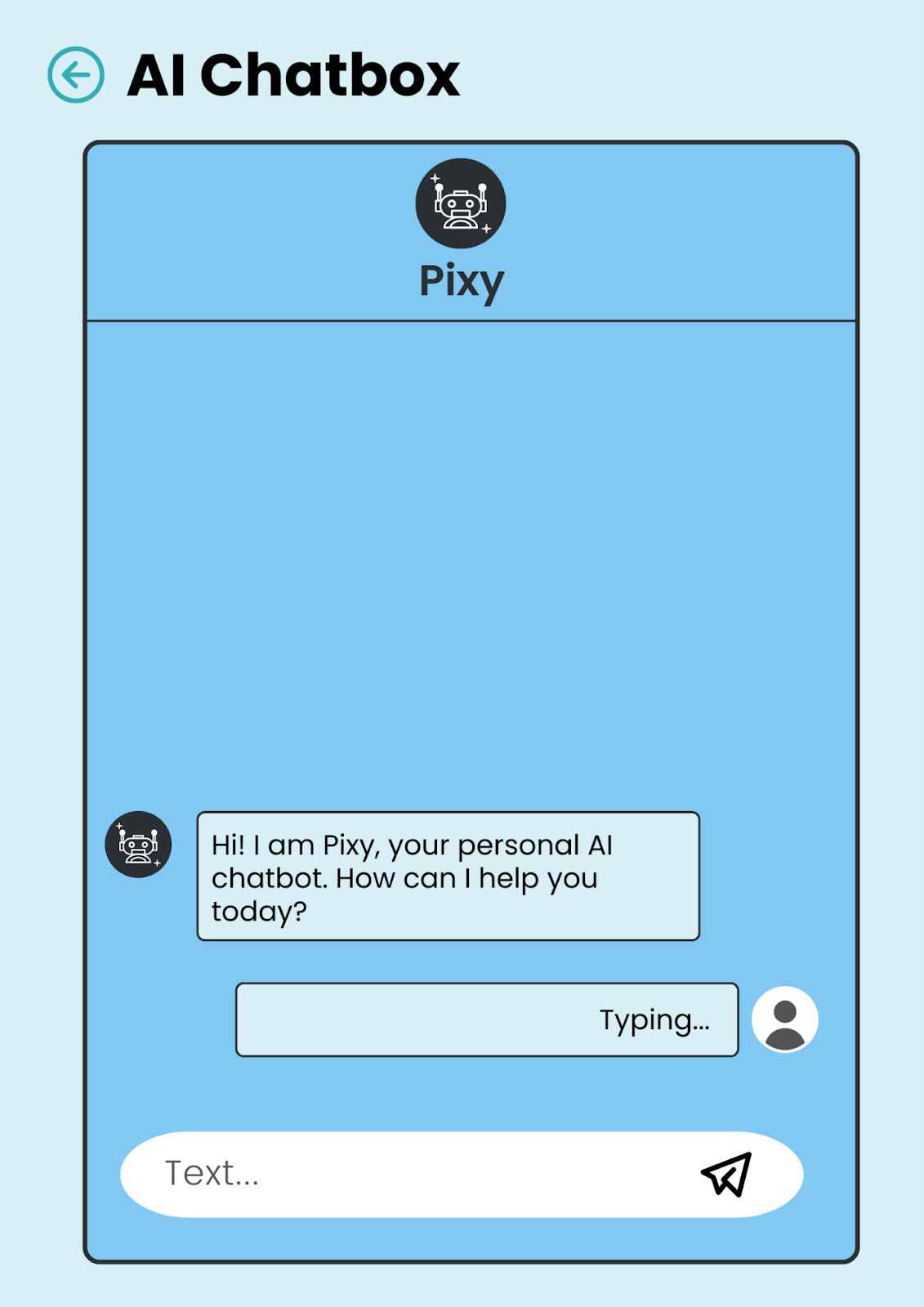
Clear and immediate feedback is critical to user assurance and task progression. On the AI Chatbox screen, the "Typing..." indicator serves as real-time feedback, confirming that the AI chatbot, Pixy, has received user input and is actively processing a response. For critical actions, such as confirming an appointment on the Appointment Details screen, the design intends to provide explicit feedback whether through a confirmation message, a status change, or a transition to a confirmation screen to unequivocally inform the user that their action was successful. Similarly, after a user completes the mental health assessment on the MINDA screen, the "SCORE" section immediately displays quantified results, providing clear, actionable feedback on their performance.
4. Dialogue:
Upon the completion of a significant task, it is imperative to provide a clear sense of closure. For example, once a user confirms an appointment on the Appointment Details screen, the system is designed to transition to a definitive confirmation state be it a confirmation screen or a refreshed view on the Home screen signaling that the task is complete. Likewise, upon submitting a report on the Issue Report screen, the user should receive a clear acknowledgment that their submission has been processed, eliminating any ambiguity regarding the action's success. This approach fosters a sense of accomplishment and clarity.
5. Error Handling:
While detailed error messages are not visually represented in these wireframes, the underlying design anticipates potential user errors. For instance, on the Issue Report screen, should a user attempt to submit an incomplete form, the system would be programmed to provide a clear, constructive error message, guiding them precisely on how to rectify the input. The categorized "Report Type" options also serve as a preventative measure, guiding users to select the appropriate category, thereby reducing the likelihood of miscategorized or unclear reports.
6. Permit Reversal of Actions:
A cornerstone of user control is the ability to easily reverse actions. The consistent presence of the back arrow icon on virtually every screen is the primary mechanism for this. It allows users to confidently explore the application, knowing they can always retreat to the previous state if an unintended selection is made or an incorrect path is navigated. Additionally, the "X" icon to dismiss the "Dental Appointment Tomorrow!" notification on the Home screen offers a specific, direct way to reverse the visibility of that alert.
7. Support Internal Locus of Control:
The design empowers the user, ensuring a feeling of command over their experience. On the Appointment Type screen, users are presented with clear choices for appointment types, allowing them to initiate the process on their terms rather than being forced through a predefined flow. Similarly, the Profile and Settings screen grants users direct access to customize various preferences such as "Customize," "Language," and "Privacy and Security," reinforcing user autonomy. Even the AI Chatbox screen positions Pixy as a helpful resource for user-initiated inquiries, emphasizing that the user drives the interaction. This approach cultivates a sense of agency and control.
8. Reducing Short-Term Memory Load:
To optimize cognitive efficiency, the interface minimizes the need for users to recall information. All essential data is directly displayed and logically organized. For example, the calendar on the Appointment Details screen clearly presents all dates for May 2025, eliminating the need for mental recall. On the Profile and Settings screen, personal details are merged and presented completely, reducing the cognitive effort required to locate specific pieces of information. Furthermore, the "SCORE" breakdown on the MINDA screen immediately presents quantifiable results, making the outcome instantly comprehensible. The consistent use of clear, simple labels and intuitive icons across all screens also significantly reduces the mental effort required to understand and interact with the interface.